

Learn why website speed for SEO is critical for growth. Discover how fast load times improve Google rankings, enhance user experience, and drive higher conversions for your business.
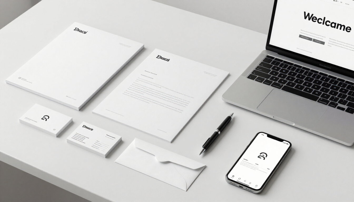
Discover how consistent branding builds customer trust, improves recognition, and drives business growth. Learn Arluna Digital’s strategy for cohesive brand identity.
Stop wasting your ad spend. Learn the 7 most common Facebook Ads mistakes and practical fixes to improve your ROI and PPC management results in 2026.

Learn how to generate leads without ads using SEO, content marketing, and Google Business Profile optimization. Arluna Digital shows you how to build a sustainable growth system.

Discover how ad psychology, emotional triggers, and persuasive visuals create high-converting ads. Master the science of conversion with Arluna Digital's expert guide.

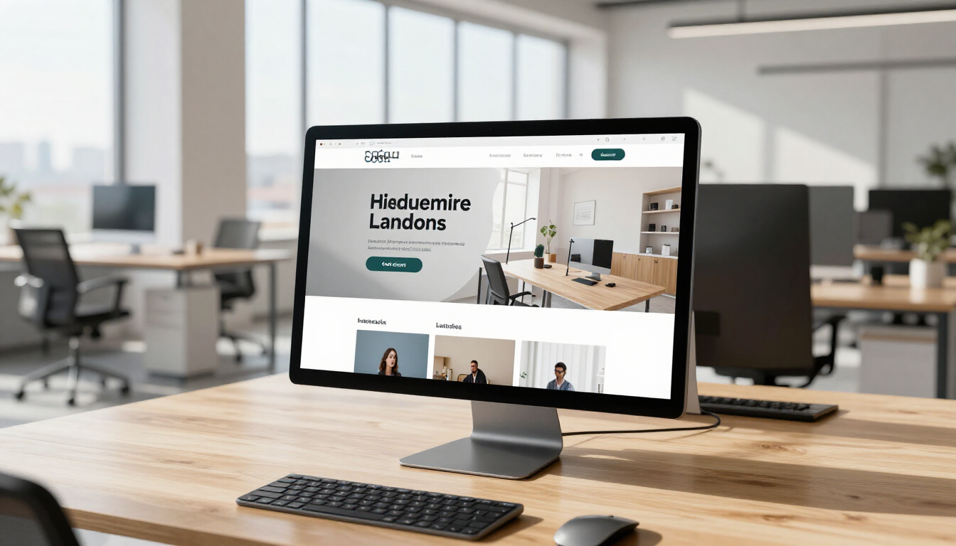
Learn what makes a website mobile friendly, including responsive design, UX best practices, and SEO impact to boost your business growth and ranking in 2026.

Learn the most effective email marketing strategies to increase sales, including segmentation, automation, and high-converting funnels to grow your business.

Discover how to build brand authority online using SEO, content marketing, and social proof. Arluna Digital's guide to establishing trust and growth in 2026.

Discover 15 actionable social media content ideas for small businesses to drive engagement, generate leads, and build a professional brand presence online.
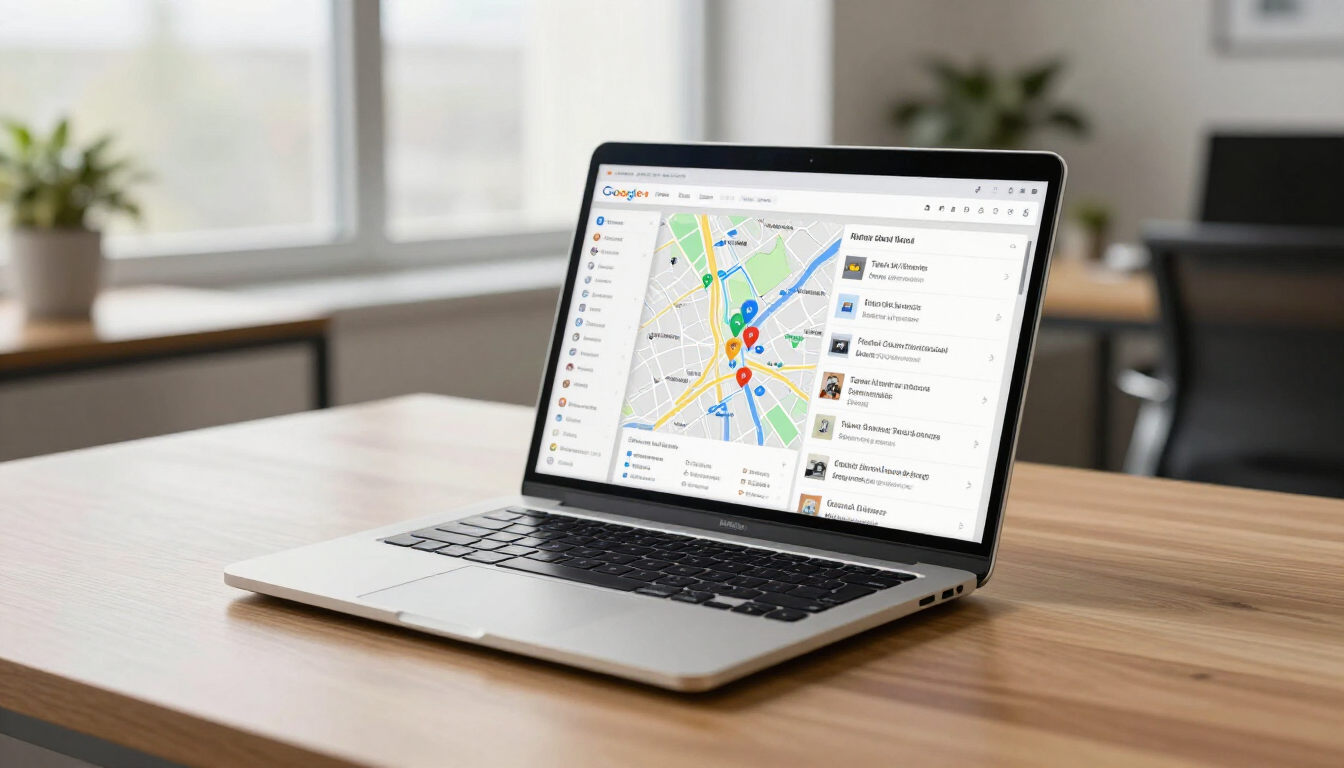
Discover why a Google Business Profile is essential for local SEO, visibility, and lead generation. Learn how Arluna Digital can help you dominate local search.