What Makes a Website Mobile Friendly? (2026 Guide)

June 22, 2026

Share this article

A mobile-friendly website is a site designed to function perfectly across all handheld devices, including smartphones and tablets. It utilizes responsive design to automatically scale content, ensuring text is readable, navigation is intuitive, and buttons are easily clickable without the need for manual zooming or horizontal scrolling.

What is a Mobile-Friendly Website?

To understand what makes a website mobile friendly, we have to look beyond just 'shrinking' a desktop screen. In today’s digital landscape, a mobile-friendly site is the baseline for business legitimacy. It means that whether a customer finds you while sitting at a desk or while standing in line at a coffee shop, their experience remains seamless.

At Arluna Digital, we view mobile-friendliness as a combination of technical precision and empathetic user experience (UX). It’s not just about fitting things on a smaller screen; it’s about prioritizing the information a mobile user needs most. A mobile-optimized site often features simplified navigation, larger touch-targets, and compressed images to ensure fast loading times over cellular networks.

Why is Responsive Design Essential?

Responsive design is the gold standard for creating a mobile-friendly website. Unlike older methods where developers created a separate 'mobile' version of a site (often on a subdomain like m.example.com), responsive design uses a single codebase that 'responds' to the screen size of the device. This approach is highly recommended for several reasons:

  • Consistency: Users get the same branding and content regardless of their device.
  • Maintenance: You only have to update one website instead of two.
  • SEO Efficiency: Google prefers a single URL for indexing and crawling.
  • Future-Proofing: It works on new devices with unique screen dimensions.
  • Cost-Effectiveness: Reduces long-term development and management costs.

When we handle web design and development , we prioritize fluid grids and flexible images. This ensures that your site looks just as professional on an iPhone 15 as it does on a massive 32-inch 4K monitor. Without this flexibility, you risk frustrating users who will likely bounce back to search results—and likely into the arms of a competitor.

Responsive Design View

How Does Mobile Friendliness Affect SEO?

If you care about your visibility on Google, mobile-friendliness is non-negotiable. Since 2019, Google has moved to Mobile-First Indexing . This means Google predominantly uses the mobile version of a site’s content for indexing and ranking. If your desktop site is perfect but your mobile site is broken or difficult to use, your overall SEO rankings will suffer across the board.

Search engines prioritize the user. If Google sends a user to a site that is hard to read on a phone, it reflects poorly on the search engine. Therefore, mobile optimization is a heavily weighted ranking factor. Key elements that influence your SEO include:

  • Load Speed: Mobile users are often on the go with slower connections.
  • Core Web Vitals: Metrics that measure loading, interactivity, and visual stability.
  • User Engagement: High bounce rates on mobile signal to Google that your site isn't helpful.
  • Accessibility: Proper font sizes and tap targets ensure everyone can use your site.
  • Content Parity: Ensuring mobile users see the same high-quality content as desktop users.

Mobile-First Indexing and Your Google Rankings

Many business owners mistakenly believe that their desktop performance is what determines their search position. In reality, Google’s bots are crawling your site as if they were a smartphone. If your mobile layout hides important text or makes it impossible to click a 'Contact' button, you are essentially invisible to a significant portion of your audience.

We often integrate mobile SEO strategies with our PPC advertising campaigns. Why? Because if you are paying for clicks, you want to make sure that the landing page is perfectly optimized for the device the user is holding. A poor mobile experience can double your cost-per-acquisition simply because mobile users can't find what they need quickly.

SEO Performance Metrics

Can a Mobile Site Increase Your Conversions?

Absolutely. A mobile-friendly website is a conversion machine. When a site is easy to navigate, users stay longer. When they stay longer, they are more likely to engage with your content, sign up for your newsletter, or make a purchase. Mobile users are often 'high-intent' users—they are looking for a solution now .

To maximize conversions, you need to focus on 'Thumb-Friendly' design. This means placing critical buttons (like 'Call Now' or 'Book Appointment') within easy reach of a user’s thumb. At Arluna Digital, we focus on streamlining the path to purchase. This includes simplifying forms, enabling one-click calling, and ensuring your branding is clear and trustworthy even on a small screen.

Key Technical Elements of Mobile Optimization

To ensure your site is truly ready for the mobile era, check these five technical pillars:

  1. Avoid Flash: Most mobile browsers do not support it; use HTML5 instead.
  2. Size Content to Viewport: Users should never have to scroll horizontally.
  3. Optimize Images: Use WebP formats and lazy loading to keep speeds high.
  4. Font Size: Keep body text at least 16px to avoid the 'pinch-to-zoom' trap.
  5. Spacing: Ensure links and buttons have enough space to prevent 'fat-finger' errors.

How to Test Your Site’s Mobile Performance?

You don’t have to guess if your site is mobile-friendly. You can use Google’s PageSpeed Insights or simply open your site on multiple devices. Look for 'Layout Shifts'—when elements jump around as the page loads—and check how long it takes for the main content to become interactive. If it takes more than 3 seconds, you are likely losing half of your potential traffic.

Taking Your Mobile Strategy to the Next Level

In 2026, a mobile-friendly website isn't a 'nice-to-have'—it's the core of your digital identity. From boosting your SEO rankings to providing a platform for high-converting email marketing campaigns, your mobile presence dictates your growth potential.

Key Takeaways for Your Business:

  • Prioritize Speed: Faster sites rank better and convert higher.
  • Use Responsive Design: It’s the most efficient way to manage your presence.
  • Focus on UX: Make it easy for customers to contact you or buy from you.
  • Audit Regularly: Mobile standards change; ensure your site stays updated.

If your current website feels clunky on a phone, or if you’ve noticed your search rankings slipping, it’s time for a professional audit. At Arluna Digital, we specialize in building high-performance, mobile-first websites that turn visitors into loyal customers.

Ready to dominate the mobile market? Contact our team today to discuss how we can optimize your web presence for measurable growth.

Recent Posts

Digital marketing strategy session focused on email growth and sales.
June 15, 2026
Learn the most effective email marketing strategies to increase sales, including segmentation, automation, and high-converting funnels to grow your business.
A professional team discussing online brand authority and digital strategy.
June 11, 2026
Discover how to build brand authority online using SEO, content marketing, and social proof. Arluna Digital's guide to establishing trust and growth in 2026.
Team working on social media content ideas in a modern office.
June 4, 2026
Discover 15 actionable social media content ideas for small businesses to drive engagement, generate leads, and build a professional brand presence online.
Google Business Profile listing on a laptop screen
May 28, 2026
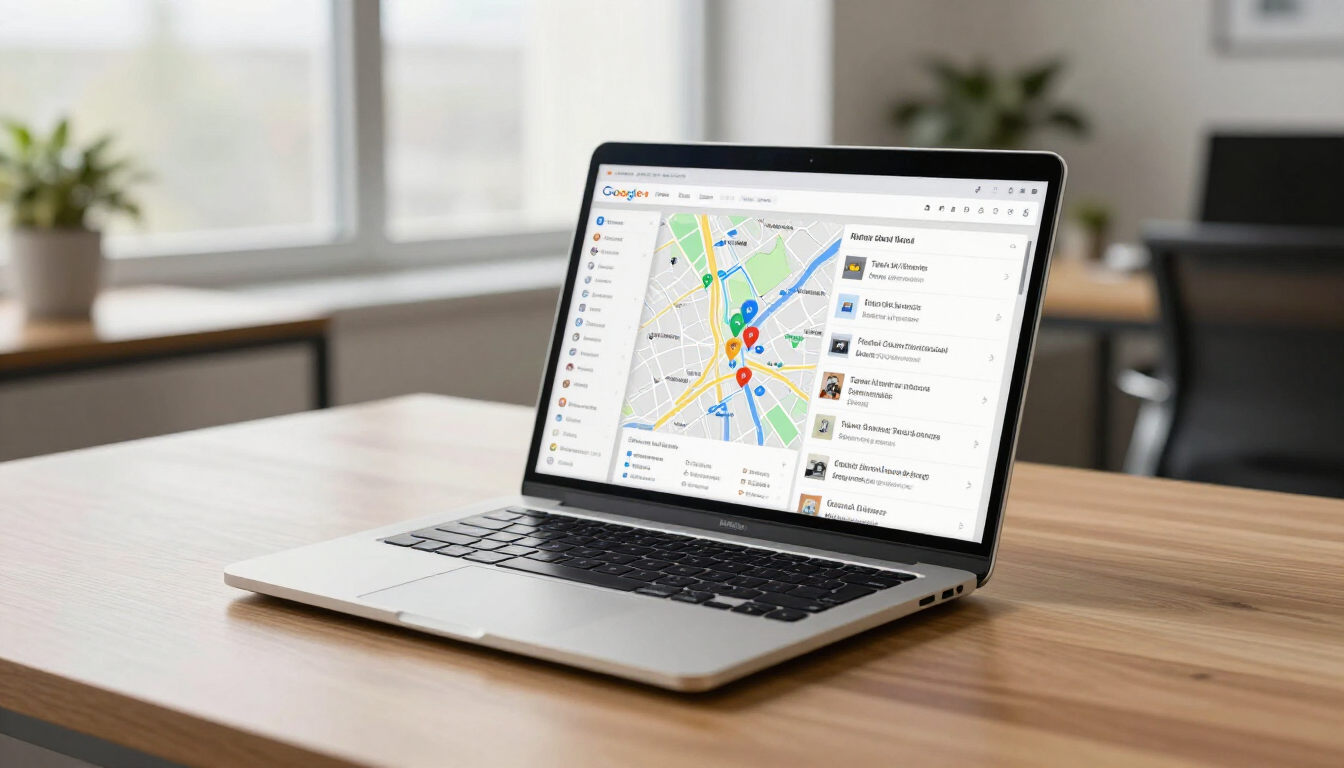
Discover why a Google Business Profile is essential for local SEO, visibility, and lead generation. Learn how Arluna Digital can help you dominate local search.
Frustrated business owner looking at a poorly designed website on a laptop.
May 25, 2026
Learn the top 10 website mistakes killing your conversions and SEO. Discover how to fix slow speeds, poor mobile design, and weak CTAs to grow your business.
Modern landing page design on a laptop screen representing high conversion rates
May 21, 2026
Learn how to build a high-converting landing page with Arluna Digital. Discover key elements like CTAs, headlines, and trust signals to drive ROI in 2026.
Local SEO search results on a smartphone screen in a cafe setting
May 18, 2026
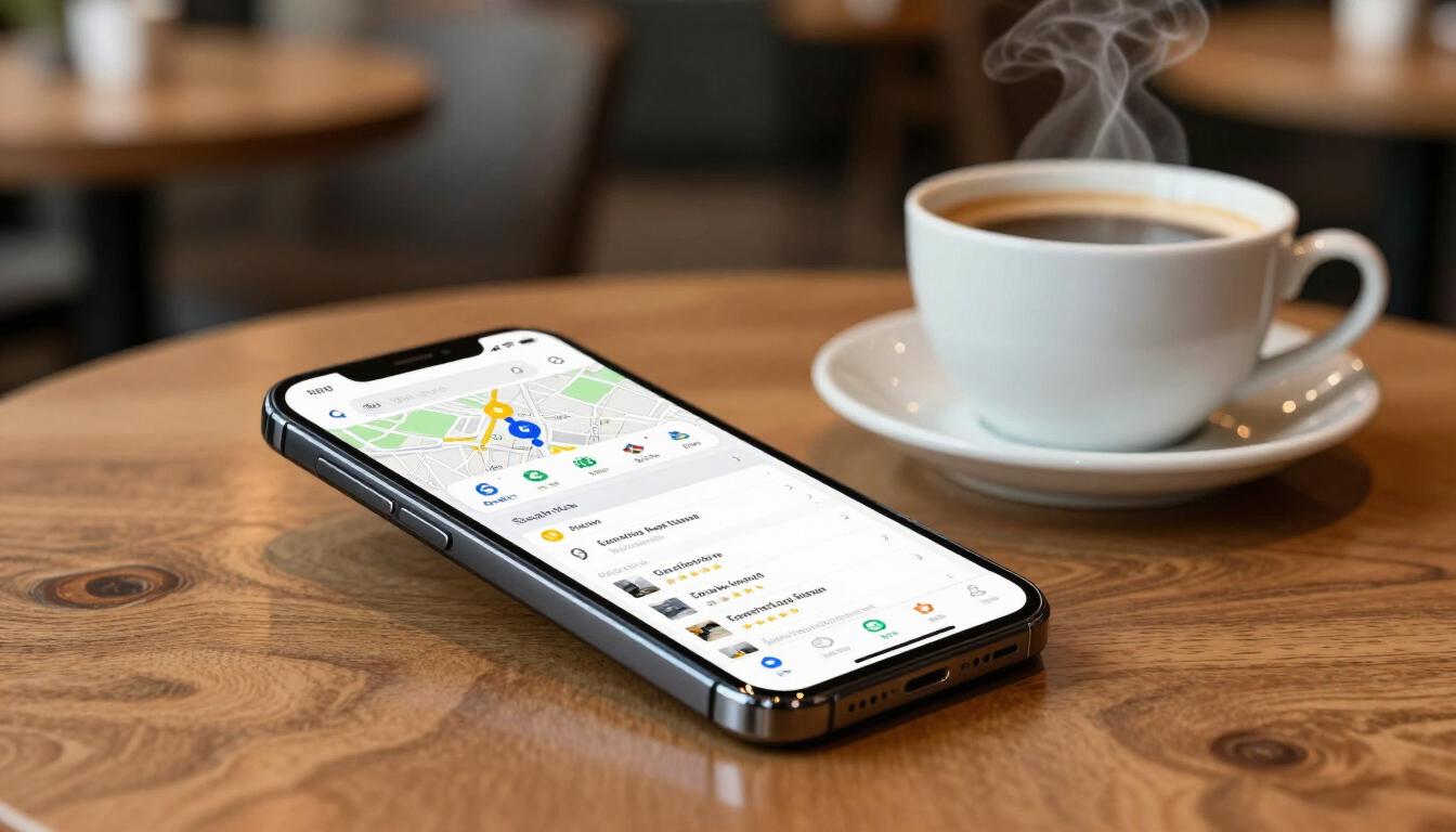
Learn how local SEO helps small businesses dominate Google Search. Master GBP optimization, reviews, and website SEO to drive traffic and leads with Arluna Digital.
Comparison chart of SEO, PPC, and Social Media Marketing channels for small business owners.
May 14, 2026
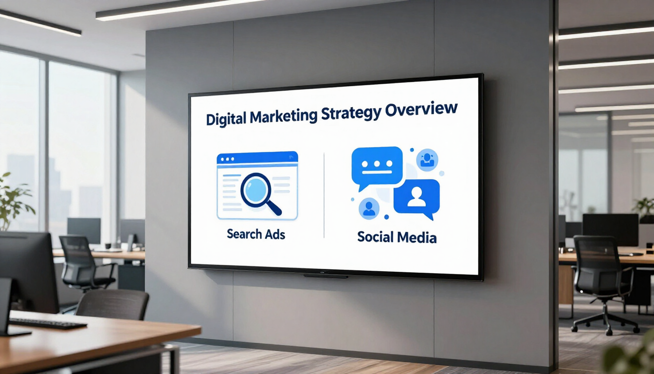
Learn the primary differences between SEO, PPC, and social media marketing. Discover which digital marketing channel is best for your small business growth.
Digital marketing dashboard showing Google Business Profile and website analytics working together.
May 12, 2026
Learn how integrating your Google Business Profile and website boosts local SEO, builds consumer trust, and drives high-quality leads.
Secure digital lock icon over a professional Kansas City business backdrop
May 12, 2026
Learn how website security protects Kansas businesses from cyber threats. Discover the essentials of SSL certificates, backups, and malware protection for local growth.
Show More